
Is your law firm’s website already optimized for mobile use? If not, you could be missing out on some of your best clients or cases.

Picture this:
When someone gets involved in a car accident, the first thing they do is to gather information. They can do this easily using their smartphones to find answers to whatever life has confronted them with.
So if this person googles “car accident lawyers near me”, a link to your website pops up on their phone and they click it. But wait! Your website is too slow and to make matters worse, the endless scrolling makes it hard to navigate your site.
Frustrated, the user just clicks on the back button and finds your competitor’s website. Its speed is on the top level and navigation is a breeze so they decide to seek their legal counsel instead. Ouch! You’ve just lost a potential client.
What Is Mobile Optimization?

Mobile search makes up more than half of online search traffic. Google has also shifted its algorithms to crawl mobile versions of sites instead of desktop versions. Therefore, mobile optimization affects your search engine rankings but SEO is just a key element in the bigger picture.
Mobile optimization is about enhancing your firm’s website for mobile users by making your web pages user-friendly and allowing seamless navigation to provide a positive experience for smaller screens.
Why Should Law Firms Be Optimized for Mobile?
How does mobile optimization elevate you above your competition?
Let’s dive in.
Improve user experience

First impressions always stick, so when a web visitor finds themselves pinching their screens or zooming a lot, they’ll give up and try another site.
Mobile optimization lets you engage web visitors with mobile-specific features such as mapping, optimal speed, and click-to-call.
This helps connect users within your geographic proximity connect with you and make a positive brand statement.
Reduce bounce rates

Mobile users are accessing your site on the go so you have a limited amount of time to capture their attention.
When you provide a better user experience for mobile users, they’re more likely to stick around and explore what you have to offer.
If a web visitor is able to navigate your pages easily, you increase the dwell time as well as your chance of converting them into clients.
Increase search engine rankings

Mobile optimization has become an integral part of search engine optimization. Back in 2016, the rapid increase of mobile users prompted Google to announce that they’ll be trying out the Mobile-First Indexing algorithm.
The Mobile-First Indexing uses mobile friendliness as a baseline for determining search rankings. This algorithm makes it impossible to rank in Google’s first page results if your site isn’t optimized for mobile users.
Let’s explore this algorithm further.
Mobile-First Indexing

Historically, Google used the desktop version of the content on a page to evaluate its relevance to a searcher’s query.
However, since most searchers access Google Search using their phones, Google began indexing and ranking pages using the mobile version. Mobile-First Indexing will be enabled by default for new websites.
What does this mean for existing websites?
Google insists that it will keep monitoring web pages and send notifications to users using the Search Console. Provided websites follow it’s best practices, they’ll be okay.
How to Setup Your Site for Mobile Visitors
To configure your site for mobile, there are three ways to go about it.
For starters, you could use the “M” configuration. This is where you have the desktop version and a separate mobile version of your website. This means that your site figures out the device your web visitor is using and then directs them to the URL that’s optimized for that device.
Albeit you can already guess that separate URLs are hard to manage. But that’s not the only problem with this method, the “M” configuration comes with a host of SEO issues that makes it one of the worst ways to configure your website.
Secondly, Dynamic Serving distributes your content from the same URL but you’ll have specific HTML/CSS for different users based on their devices. Even though this option is better than the “M” configuration, it usually displays desktop versions to mobile users, which ruins the user experience.
Lastly, with the responsive design, your page content adapts to the device of each user. You don’t need to work with separate URLs or different HTML. It’s also the most SEO-friendly option and more importantly user-friendly.
Effective Mobile Optimization Tips
Now that you have an understanding of some important aspects of mobile optimization, how do you actually do it?
Here are some of the most effective ways to go about it.
Use Pagespeed Insights and Google Mobile usability test

Google provides many tools to optimize your site for mobile such as PageSpeed Insights. This tool checks your site’s loading speed on mobile devices.
You can also use the Google Mobile Usability test that alerts you when mobile users have issues using your site.
Use structured data

Structured data or schema markup basically code in a specific format designed in a way that search engines understand it.
Structured data helps search engines to interpret the direct data unique to your law firm and what you share about your practice on your site.
Rich snippets are usually powered by structured data and it adds more details to your search results. However, Google doesn’t automatically create a rich snippet for your page.
Using structured data changes how your search results look like by giving more information to potential clients. This will increase their likelihood to click on your results.
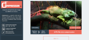
Compress images
53% of mobile users abandon sites that take more than three seconds to load. Another study revealed that the stress levels caused by mobile delays can be compared to watching a horror movie.
Large image files have the tendency of slowing page speed but you can reduce image size and affect its quality.
You have to reduce image size without reducing its quality because this will have an impact on user experience. If you use WordPress, consider installing an image optimizer such as Compressor.io and Smush Image Compression to do this in a snap. CDNs also make images load faster.
Optimize for voice search

Voice search has gained mileage due to its convenience for users to speak with an assistant instead of typing.
The increase in the use of digital assistants like Google’s Assistant, Apple’s Siri, Microsoft’s Cortana as well as Amazon’s Alexa makes optimizing for voice search critical for your law firm.
To make voice search work best for you, keep in mind the following variables:
- Most people use voice search to locate local businesses
- Voice searchers want immediate results
- Conversational style voice queries matter
To optimize your law firm’s site for voice search, consider using long-tail keywords. Make sure your keywords answer who, what, where, when and why.
In addition, include “near me” in your meta description, HTML headers, and title tags. Remember to incorporate landmarks and common words used to describe an area within your location.
Consider Google AMP
Accelerated Mobile Pages (AMP) are mobile-optimized versions of your websites stripped down to load four times faster than standard websites. You can add AMP by installing the plugin and customize it to match your law firm.
However, AMP also limits your site’s functionality because you will not have full control of your ads. For instance, you will not be able to include a lightbox or popup. So you have to factor the benefits and drawbacks of AMP before giving it a shot.
Avoid interstitial pop-ups
Speaking of pop-ups, back in 2017, Google decided that all interstitials ruining user experience will negatively impact a site’s SEO ranking juice. These intrusive interstitials are popup ads that tend to block most of a page.
When it comes to mobile, these popups have less screen estate. It covers most or all the content on a web page making it impossible to close it. These interstitial ads are not even triggered by user action creating an unpleasant user experience.
The only problem is that most businesses, law firms included, have to use popups because they are effective when it comes to increasing conversions.
It’s worth noting that Google is currently looking at interstitials that show up when a user first lands on a site from searches. Avoid using interstitials until the user has clicked further into your site to be safe
Let Google crawl everything

Don’t block Googlebot from accessing the important parts of your website’s code such as CSS or Javascript.
This will help Google to crawl your page to determine whether your site is mobile-friendly or not. Check your robots.txt file to allow the Googlebot to crawl everything
Use HTML5 for video and animated content
Both Android and iPhone operating systems don’t support flash. Therefore, if you embed videos in your site’s content using flash elements, it simply won’t work on mobile.
Use HTML5 for your images because you can add a variety of file types such as .png, .jpg as well as .gif.
Utilize the viewport meta tag

The viewport meta tag changes the size of your page based on the device a user is using. Without it, mobile devices will use typical desktop widths that can’t fit mobile screens.
Mobile content

The first step is to make your content easy to read on mobile devices. Your site may be optimized for mobile but if your web visitors have to squint or scroll as they read your mobile content, then it will be hard to convert them into clients.
Make your content readable for mobile users by using a bigger font of 15 or 16. Use shorter paragraphs ranging from one to three lines per paragraph.
You should also keep in mind that most people use their phones when outdoors. Don’t use low-contrast text because it’ll be harder for them to read. Remember to add contrast between the background and text too.
Utilize negative space
Negative space is the white space between text and other design elements. Using negative space helps you avoid cluttering a page to make it easier for users to find the information they need.
These increases dwell time on your site. You can also leverage this space to direct web visitors to your Call to Action button. When it comes to social share buttons, add them in the sidebar to be less distracting and visible.
Minimize redirects

As we said earlier, it takes mobile users three seconds to decide if your site is worth waiting to load. It’s important that you lower your mobile load time below this threshold.
One way you can do this is by minimizing redirects to speed up your site’s speed. Redirects are instructions that automatically take your users to a different web page.
Redirects eat up seconds of loading time creating a slower page load and this leads to increased bounce rates. You can use a tool like a redirect mapper to find out the number of redirects you have on your site.
Final Word
What’s the point of making it to the top of the search rankings and get that click only to find users pressing the back button continually? Make sure this doesn’t happen to your law firm’s website by following this mobile optimization guide.
Now, I’d like to hear from you. What are you doing to get your firm’s site ready for mobile optimization? Let me know by leaving a comment below. Of course, if you’re interested in professional consulting about optimizing your site for mobile, contact me directly today.